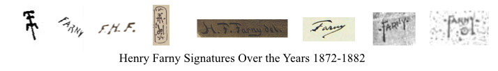
To help folks identify Farny art works, I’ve assembled some of the signatures he used over the years. The three most common, roughly in order of use, were
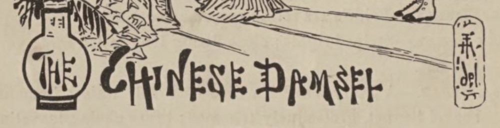
1) Symbol-Signature: Farny constructed a symbol built from Fs and an H that could well have been inspired by Chinese or Japanese writing (he did become partial to Japanese art), possibly created after studying asian art for The Chinese Damsel drawing that appears in the 1873 book by William Venable “The School Stage”. To me, it looks like he put two “F”s back to back then overlaid an H atop it.
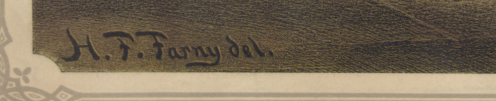
2) Cursive Signature: This is a Capital F following by lower case letters in cursive form, with a tail of the Y swishing back under the name,
3) Bullseye-and-dots Signature (aka Circumpuncts and Interpuncts): His post 1881 signature displayed his last name in all CAPS, usually angling upward from left to right, with a straight-dropped Y tail. To the right and left of his name are two dots, which may be interpuncts. Underneath he’d usually add a bullseye, a dot within a circle, also known as a circumpunct. There are varying explanations for both the dots and the bullseye. Some people have argued they exist due to Indian influences. Hard evidence for those claims remains elusive.
So, let’s begin …
1865: Farny’s 1865 Harper sketches of the Turner Festival in Cincinnati include no signatures that I can find, nor did he sign the Cincinnati Industrial Exposition images he completed for the October 19, 1872, issue of Harpers (or here at the Library of Congress), though you can see the signatures of the block engravers.
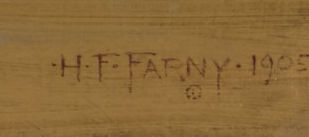
1867: He signs a landscape painting H.F. Farny 67. I am still looking for other illustrations between 1865-1872. Supposedly, he did some circus posters during this time and, likely, some other piece-meal work for magazines and/or books. Note that these signatures use traditional periods at the base of the letters.
1872: While 1867 represents a painting, the earliest illustration with a signature that I have identified, so far, comes from the 1872 book my Dr. William Venable called “A School History of the United States”. This book, as do a few others over the years, contains several different signature styles. I can only guess that, most likely, he was either experimenting with different styles; but, possibly, he simply forgot which signature he was using.
On page 163 he uses his Symbol-style signature, which would become pretty common in the later 1870s,
On pages 185 and 198 he uses his initials with periods:

On page 199 he uses all Caps:

At this point, it’s hard to know which illustrations he did when. Just because one book was published in 1872 and another in 1873 doesn’t mean that the illustrations were completed in that order. I bring this up, because Farny completed another series of sketches for Dr. Venable, this time for the book “The School Stage”, published in 1873, in which the most unique example of the symbol-signature appears (The Chinese Damsel).
1873: In the School Stage, Farny uses his initials in CAPS twice with periods at the base of the letters.

His more standard symbol three times:
And, finally, this picture includes a signature-symbol plus a “del” on the lower right of the The Chinese Damsel illustration:
The “del.“, which is not a subject I’ve explored very deeply, is “an abbreviation of the Latin delineavit, ‘he/she drew [it]’, [that]sometimes occurs in the lower margin or corner of a print, usually an engraving or an etching, to indicate a particular artist on whose original drawing the print is based.”
What is interesting about the above drawing is that in 1873 he would also use the “del.“for his famous Pork Packing in Cincinnati illustration that was shown at the Vienna’s World Fair as seen below:
What also appears is a more cursive-like signature. In later pics, he would occasionally use “del.“, but the use seems random. Again, the periods sit at the base of the letters.
1874: It’s the cursive last name that begins to mark more of his illustrations. For example, in the inaugural version of the 1874 periodical Giglampz, the short-lived satirical series which Farny both illustrated and partially wrote with Lafcadio Hearn, has Farny’s signature on the illustration’s inaugural front page:

Between 1874 and 1881: Farny’s illustrations generally fluctuate between the cursive-Farny and the symbol-Farny, though he occasionally deviates to others that we have already seen.
Fast Forward to 1881, Farny makes one, possibly two, trips West in the autumn, the first, if it happened as newspaper reports suggest, would have been to visit the Zuni Tribe at the Arizona and New Mexico northern-border. Farny would have done the work as part of a three-part story by Frank Cushing published in Century Magazine:
1882-12 Frank H. Cushing’s “My Adventures in Zuni”, Part I, pg191, Vol XXV, No2.
1883-02 Frank H. Cushing’s “My Adventures in Zuni”, Part II, pg500, Vol XXV, No4.
1883-05 Frank H. Cushing’s “My Adventures in Zuni”, Part III, pg28, Vol XXVI, No1.
Clearly, when reviewing the article’s images, Farny was experimenting with signatures. And, once again, we don’t know when or in what order he completed the illustrations. Here are some examples that suggest he is working through different ideas during his illustrations for Frank Cushing’s three-part series.
This one (of several examples) is from the 1882/12 Part I article, pg 201, and shows his name with dots midway vertically, rather than periods at the base, around the “FARNY”, but lacking what I term the bullseye:

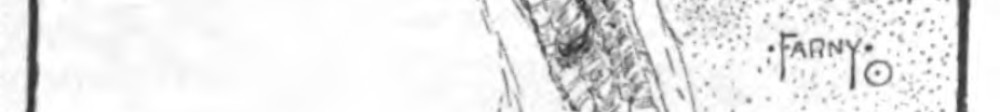
This one (of several examples) is from the 1883/05 Part 3 article, pg45, and shows the bullseye, but no outside dots:

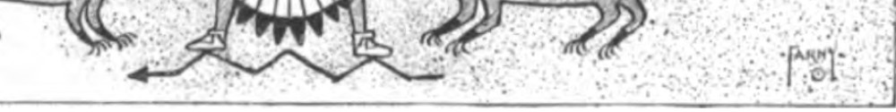
This one is from the 1882/12 Part I article, pg195, and shows the outside dots and bullseye combined, but with the bullseye to the right of the Y-tail:
And, finally, there was this one, used in the 1883-02 Part II article, which became the more common signature in his post 1881 years:
Over the decades that followed the signature changes in the early 1880s, Farny remained pretty consistent with the use of his last name and the bullseye underneath his name. That said, he varied other aspects. Here are some examples that use the random date of 1901 (again note he continently uses dots midway vertically rather than periods at the base):
•FARNY• /1901 (bullseye underneath)
•FARNY• / •1901• (bullseye underneath)
•FARNY• (bullseye underneath) with date to the right or underneath everything
•FARNY•/01 (bullseye underneath)
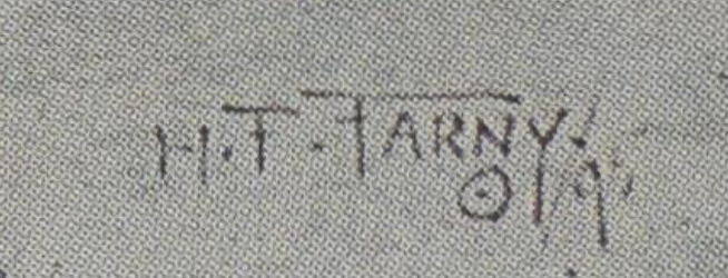
•H•F•FARNY•/01 (bullseye underneath)
•H•F•FARNY•/1901 (bullseye underneath)
•H•F•FARNY•(bullseye underneath) with date to the right or underneath everything
•H•F•F• Usually bullseye somewhere, sometimes with the date somewhere
Sometimes he’d do some variation of the above without the dots on either side.
After looking at 300 plus illustrations and more than 500 paintings, unless he was applying some unknown code for using his signature, his signature strategy seems more whimsical than strategic.
Below are some examples of this whimsy: From Saddling Up:
From the 1904 Marauders Fording a Stream:
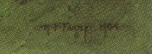
Signature 1 from “Fording the Stream” at the Gilcrease Art Collection, dated 1904:
Signature 2 from a Fording the Stream sketch from Frick Digital Collection website:
What do the bullseye and/or dots mean? From where did they originate?
Most experts point to his visit with the Sioux as the origin. However, According to Professor Herman Ten Kate in 1911, Farny signed his name with the dot, because it represents his Zuni name “Hliakwa” , which translated means “the white shell bead.” The Professor goes on to say that Farny’s accuracy for the Zuni structures was amazing, as he had been told Farny had never visited Shiwinakwin, the principal pueblo or villa of the Zuni.
The Professor also notes that Farny did meet with six traveling Zuni elders in the summer of 1882 in Washington D.C.; this meeting has been documented in several other accounts. But, if he did meet with the Zuni Elders and his dots are the result of his Zuni name, then why was he using the dots after he met with the Sioux in late 1881, but before he met with the Zuni in the Summer of 1882?
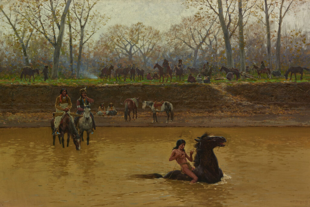
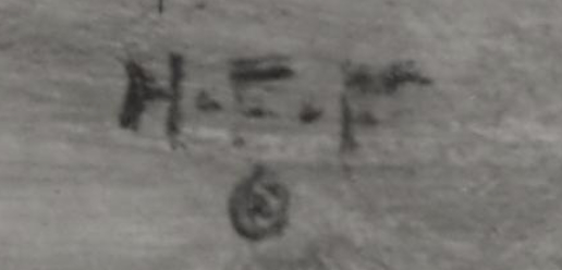
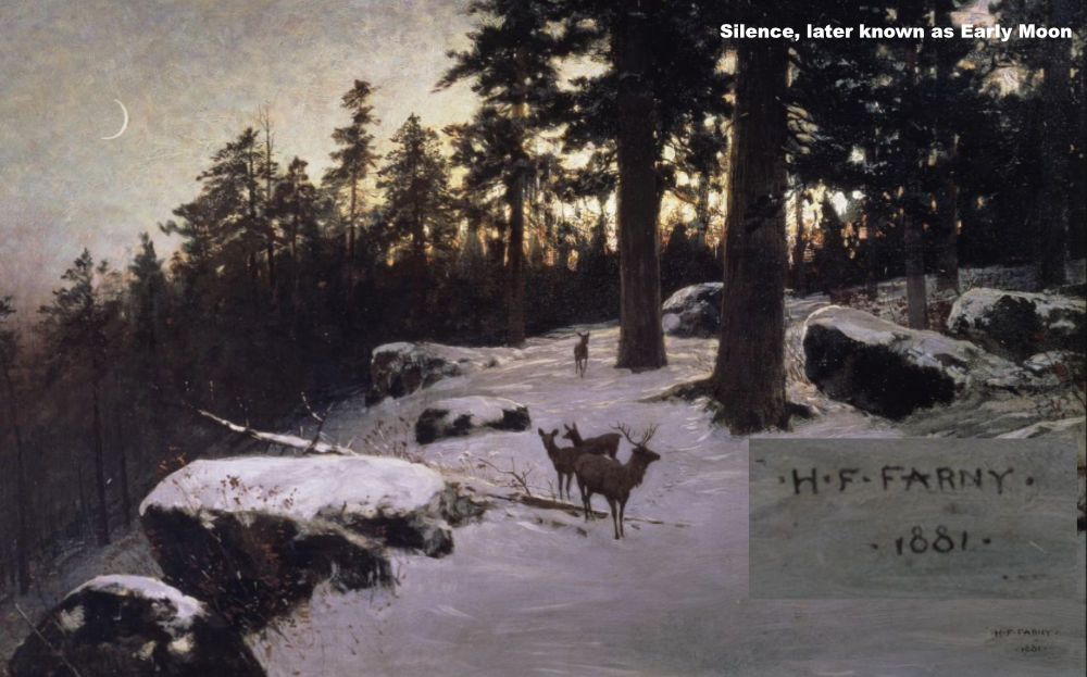
For example, Silence, later known as Early Moon, is a painting that we know he finished prior to December of 1881, based on a Cincinnati Commercial Gazette report. The work offers a surprise signature in the form of caps and dots, specifically •H•F•FARNY• then the line below •1881•. That’s certainly an unexpected change!
In January of 1882, The Cincinnati Enquirer noted that Farny had just completed “a water-color of great merit” titled The Toilers of the Plain. A close look at that signature reveals the same signature he used on Silence.
In sum, what we know is that the use of the dots and the bullseye were arrived at after some experimentation among the Zuni illustrations, with experimentations beginning near the end of 1881 and early 1882, as evidenced by the Silence and Toilers paintings.
Unfortunately, at this time, there is no concrete evidence what the dots and circle signature elements meant.
I will update this page when I gain additional signature information. If you have additional insights, opinions, or corrections, please contact me!
Born June 21, 1930 in New York City, Jean Eilers grew up in Great Neck, New York, the daughter of…